0%.
Loading
2025
blago®
Son Daven. Creating a brand for a premium Carpathian hotel
00:00
Play video
Client
Ivano-Frankivsk developer Blago. One of the largest developers in Ukraine.
Situation
The Carpathians remain a popular destination for domestic tourism. But there is a problem. Commercialization, chaotic capitalism, "render marketing", monotonous superficial resorts and buildings in the style of Provence-Bavaria-Austria... Behind all this, local authenticity is lost.
Blago decided to build more than just a place to relax. This will be the first premium hotel in Yaremche, which rethinks and actualizes Hutsul culture.
Blago decided to build more than just a place to relax. This will be the first premium hotel in Yaremche, which rethinks and actualizes Hutsul culture.
Challenge
Develop a brand for a neo-Hutsul apart-hotel: brand strategy, name, identity, communication materials.
Strategy
First of all, we challenged ourselves to restore Yaremche (and the Carpathians in general) to its authenticity.
Our audience consists of modern, over-excited Ukrainians. They are actively interested in their heritage. Instead of another ultra-max-bath, they would rather immerse themselves in the atmosphere of their ancestors' lives. Hotel by Blago will become a center of recovery on all levels — physical, moral and cultural.
Our mission: to unite the past and the future. With respect for ancestors — for descendants.
Our positioning: The New Legend of the Carpathians.
Naming
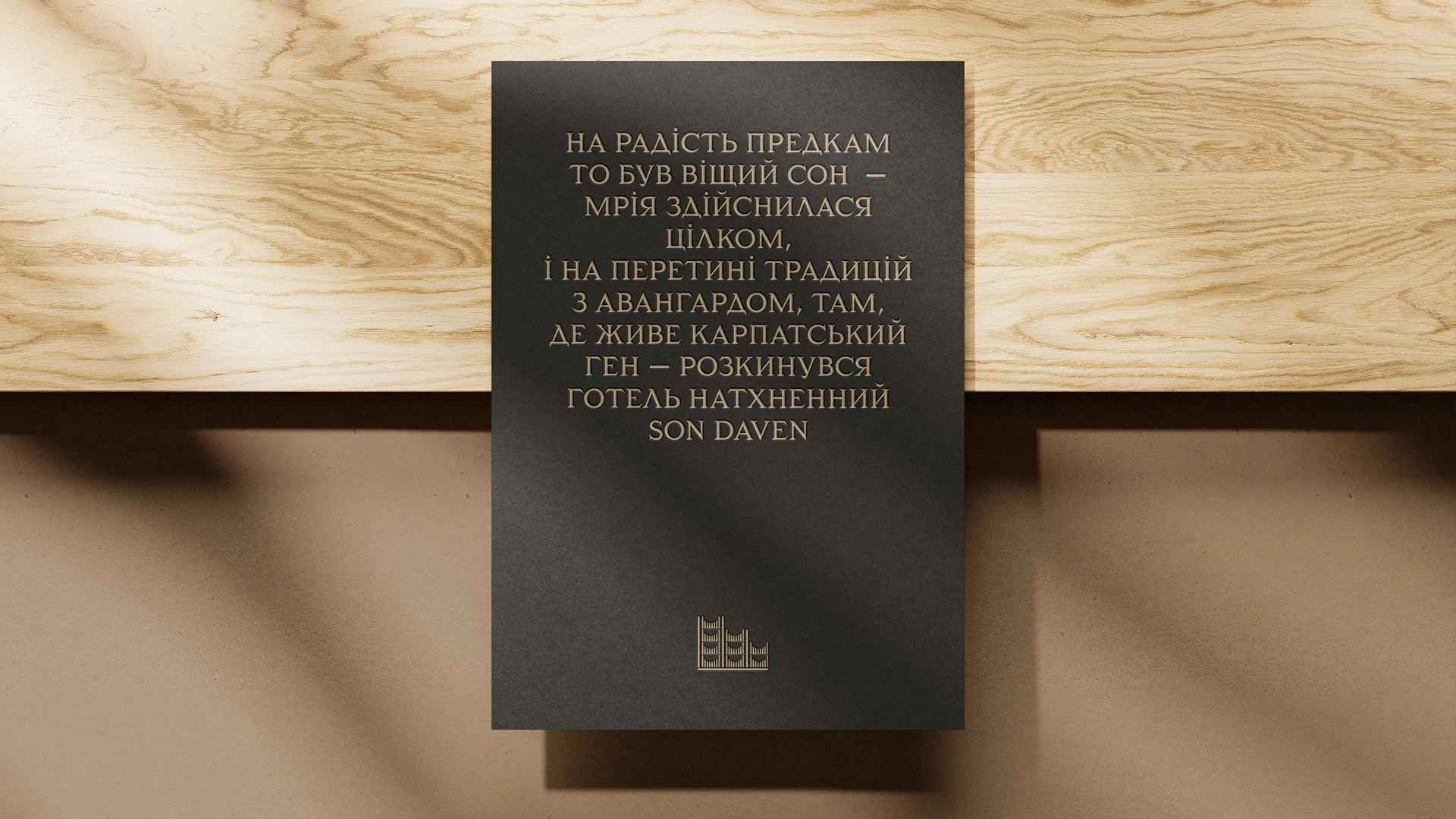
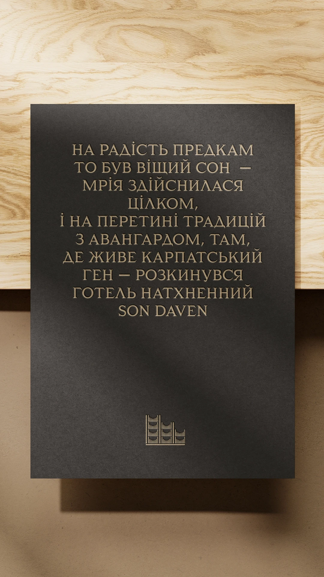
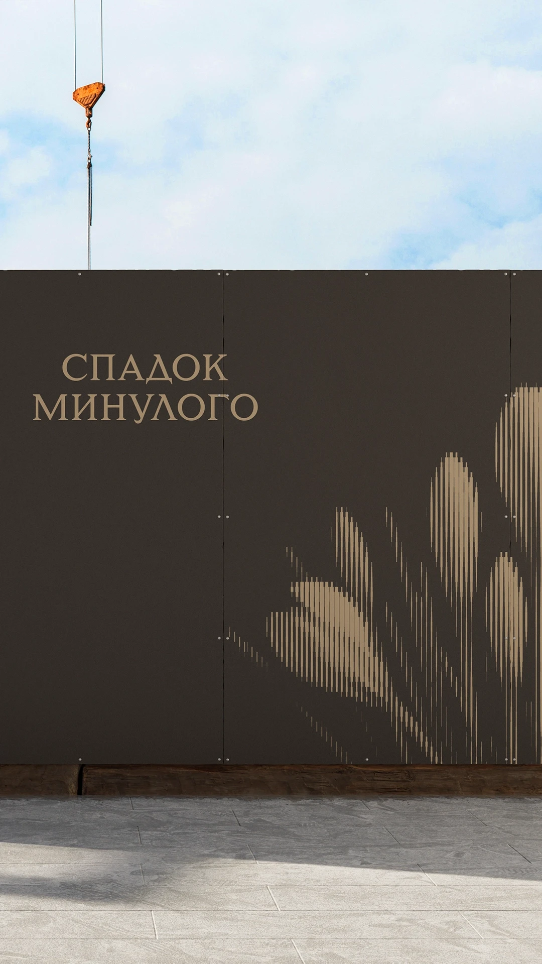
Looking at the mission, we realized: this hotel is a dream of our ancestors that has come true. Because the descendants have not just forgotten their roots, they are exploring and popularizing them.
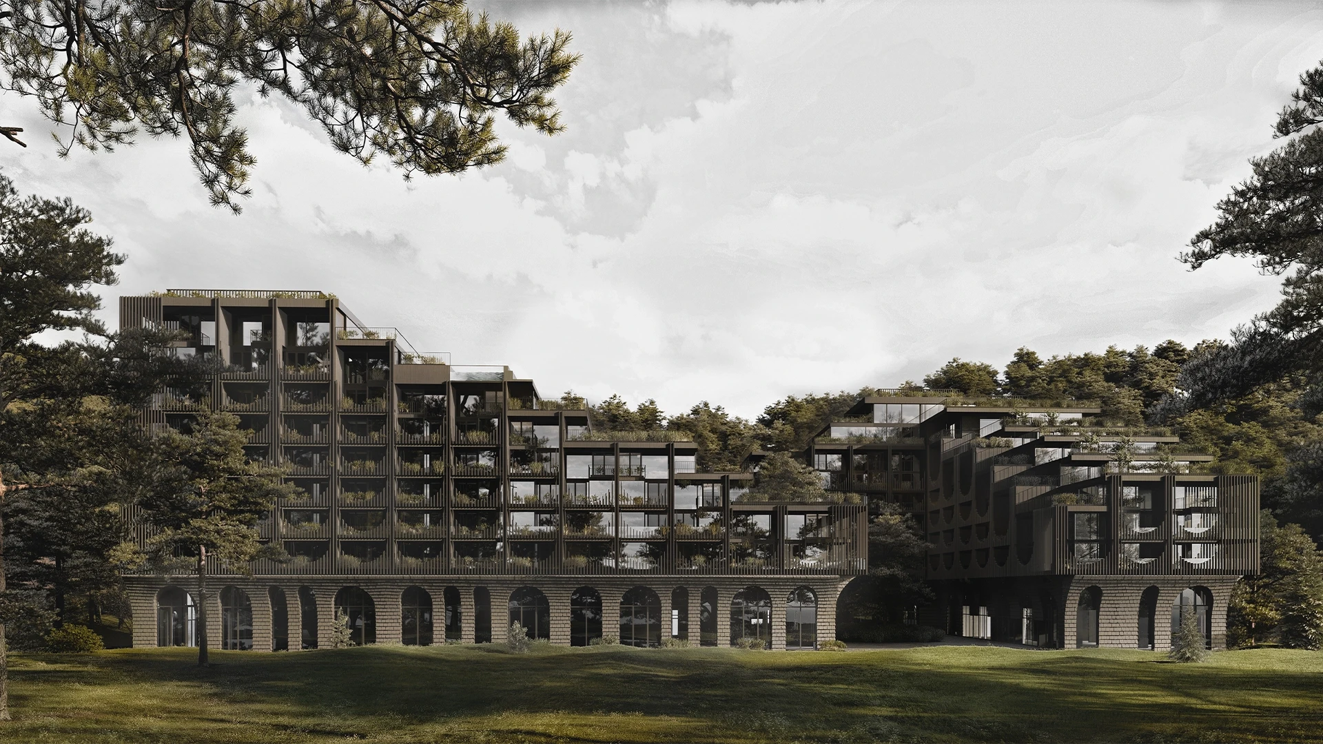
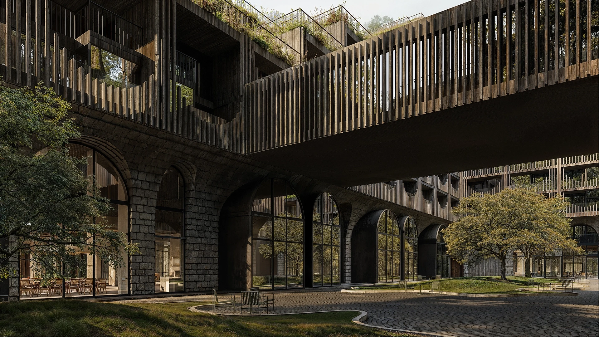
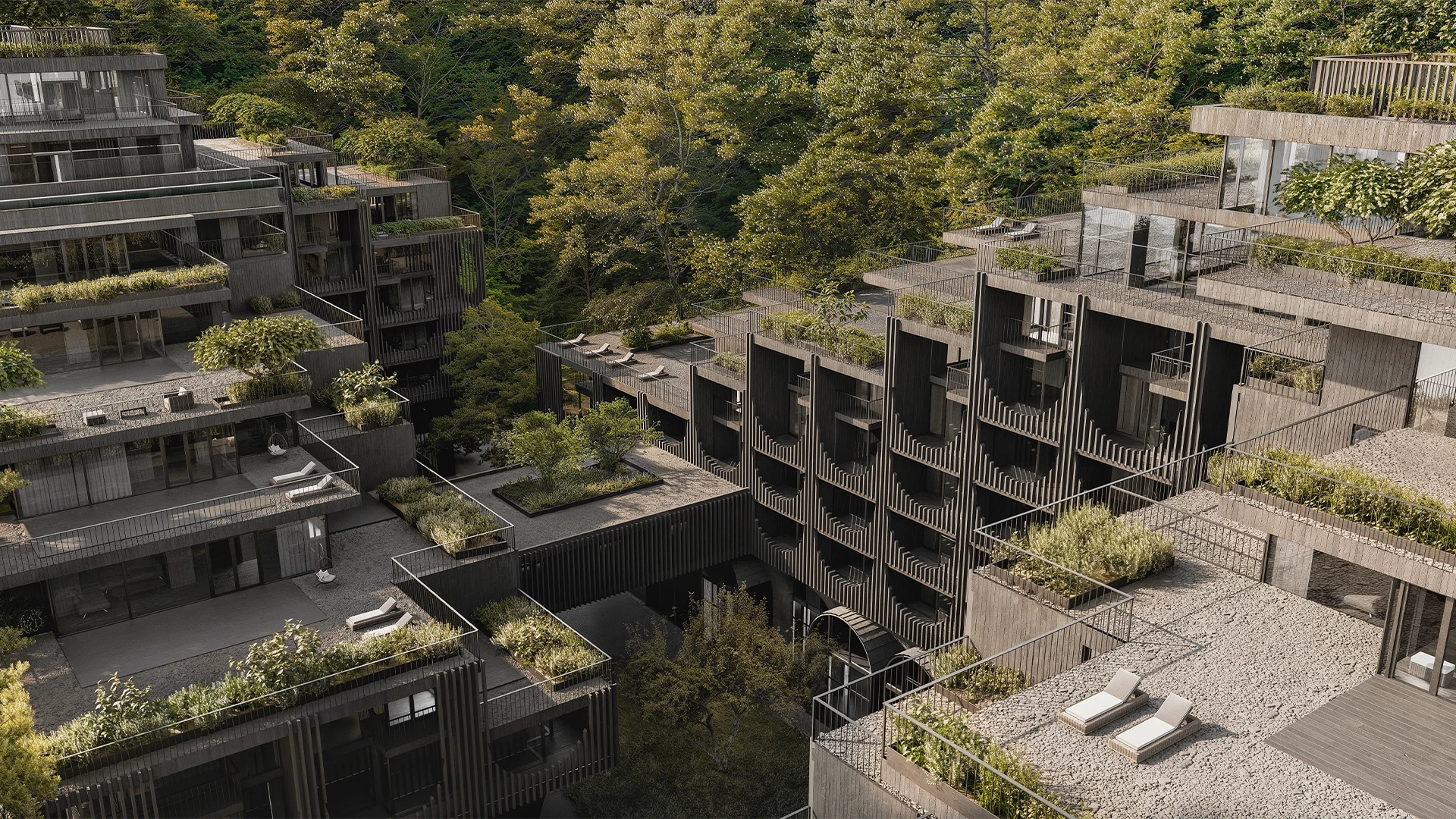
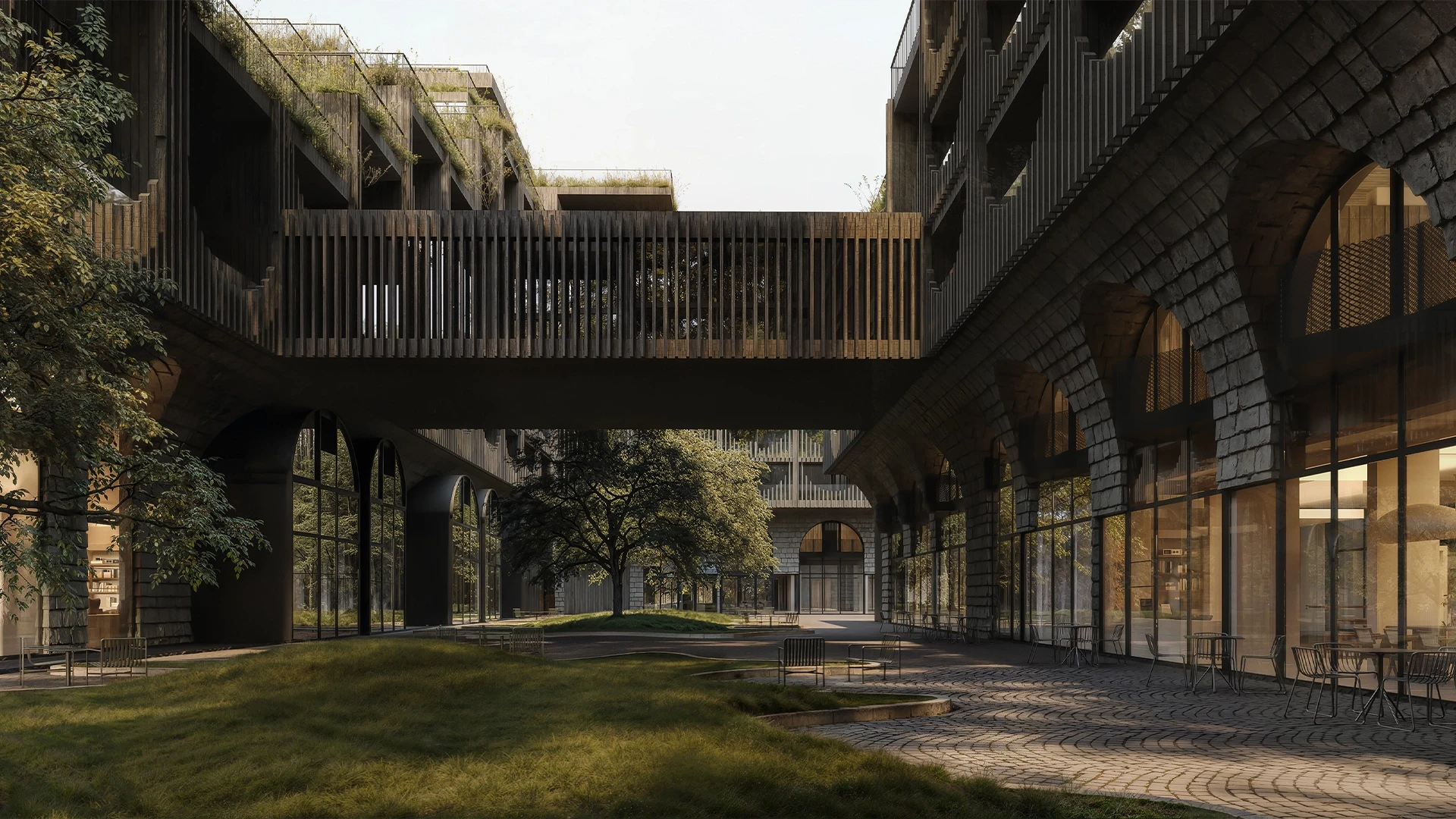
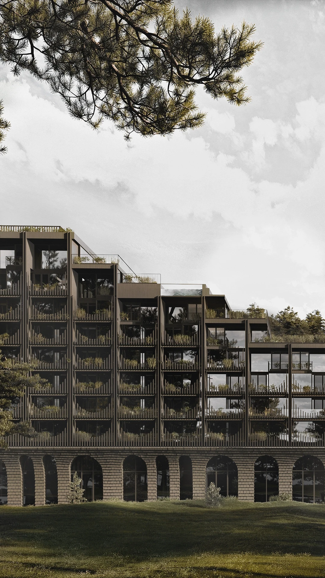
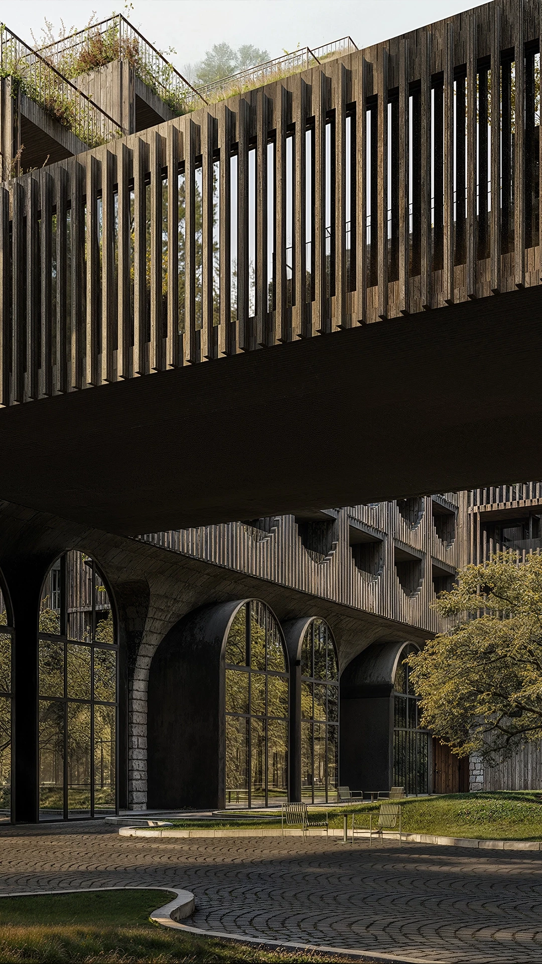
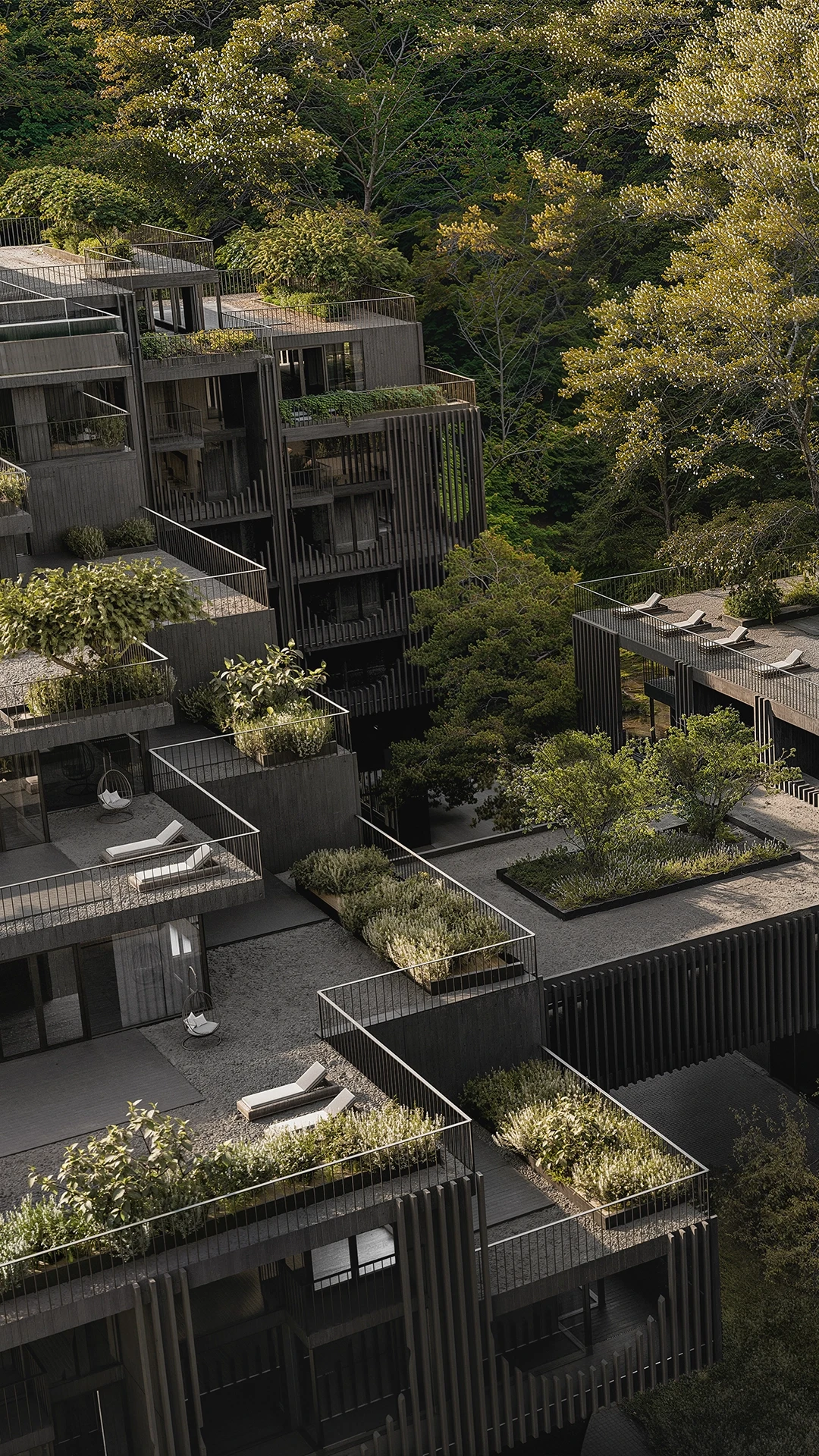
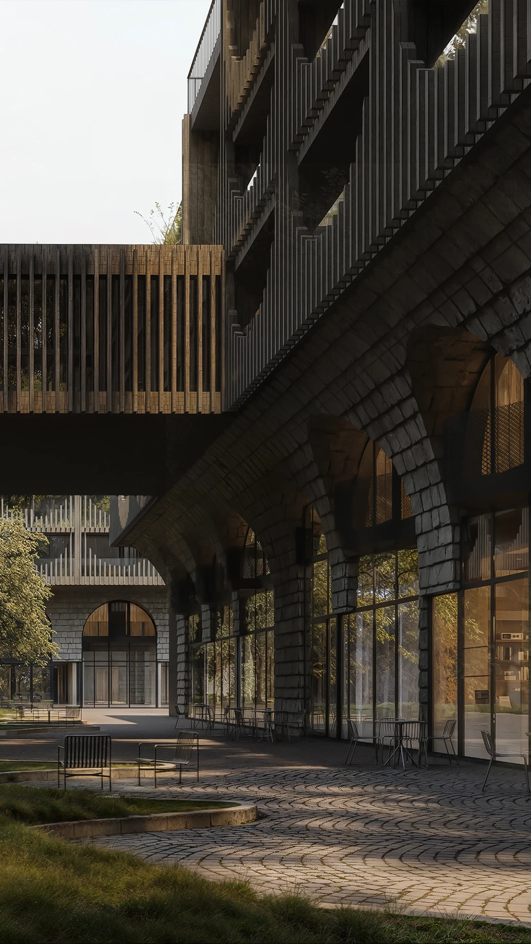
The heritage is alive, its breath is felt in every brick of the modernist building. Even the cascading exterior of the building is a tribute to the Hutsul villages, the Yaremche viaduct, and the local Probiy waterfall at the same time. Amazing!
And so the name was born…
The heritage is alive, its breath is felt in every brick of the modernist building. Even the cascading exterior of the building is a tribute to the Hutsul villages, the Yaremche viaduct, and the local Probiy waterfall at the same time. Amazing!
And so the name was born…
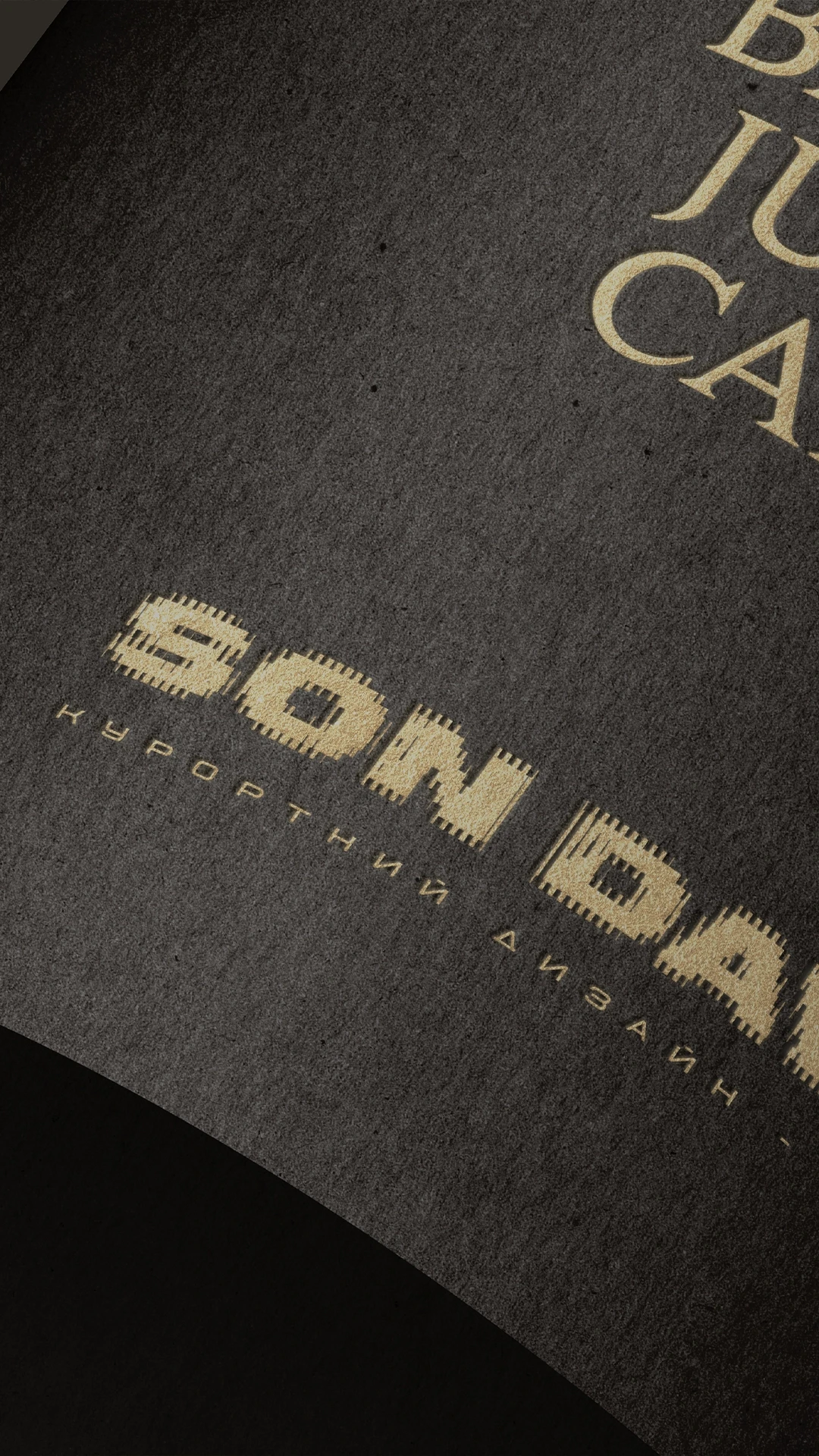
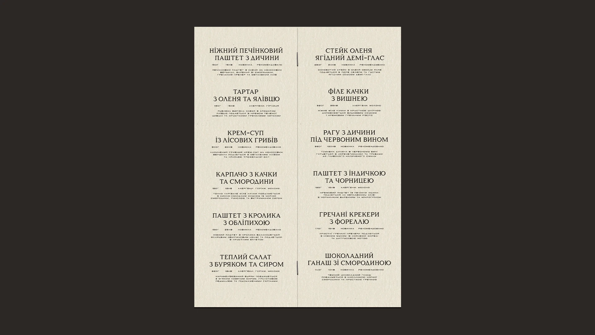
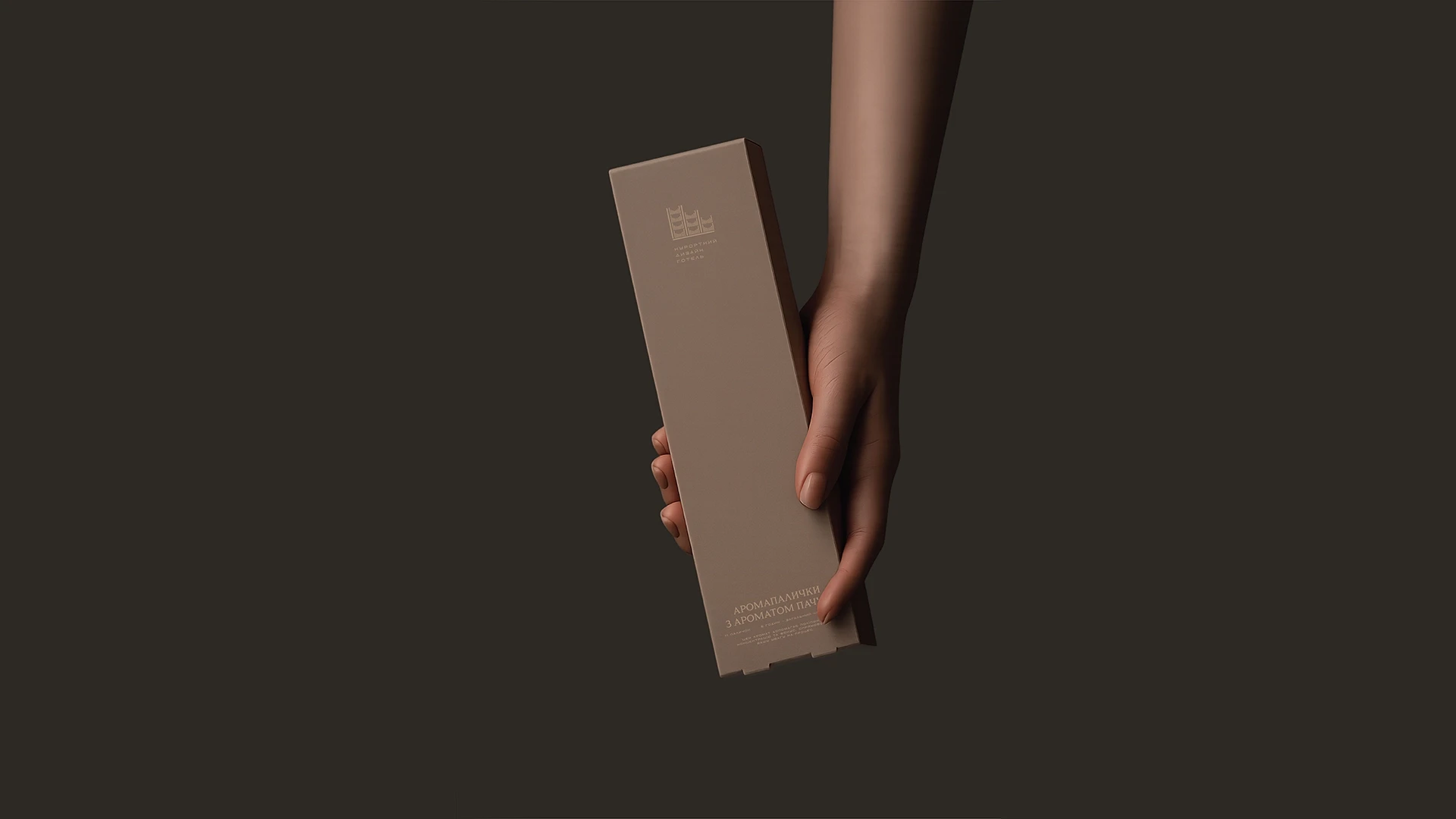
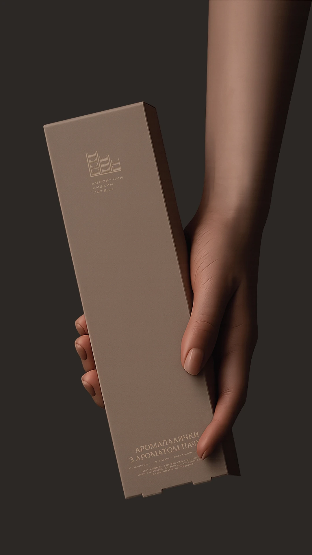
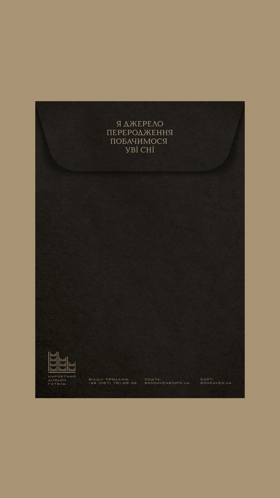
Identity
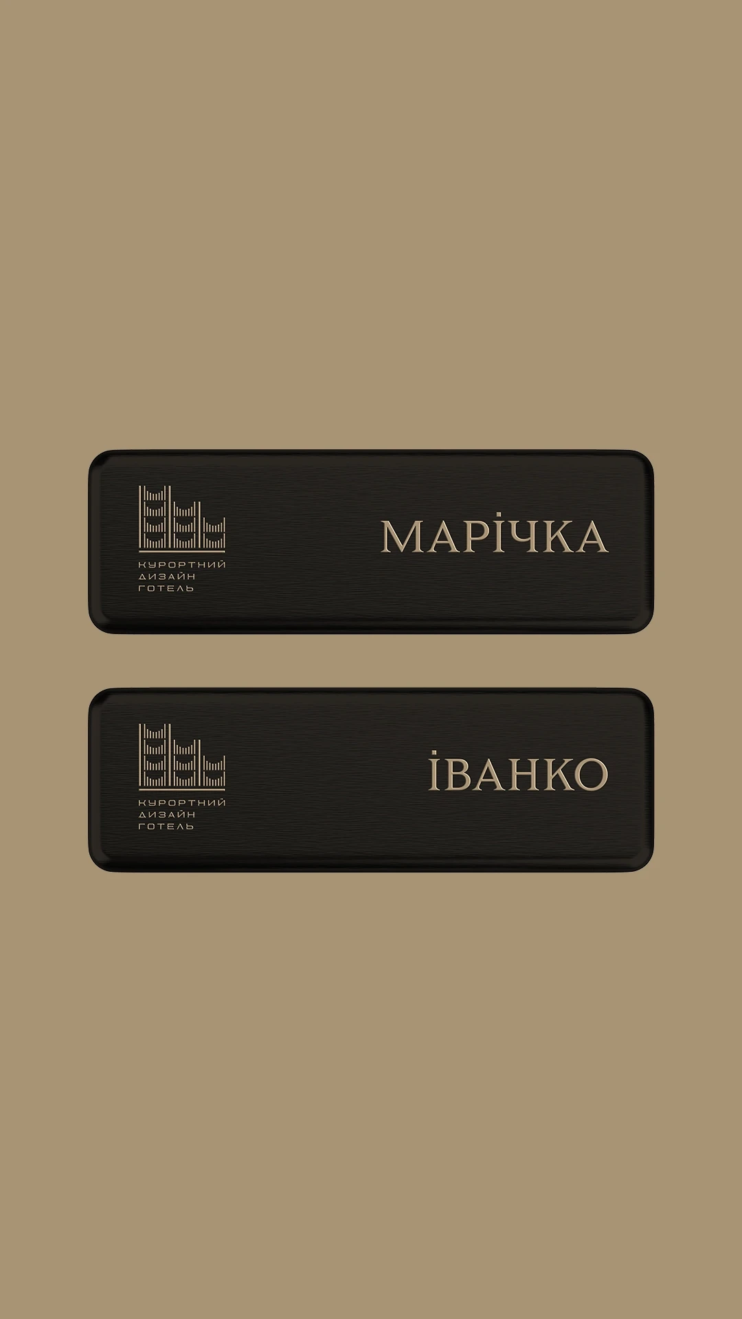
We were looking for our visual solution in the architecture of the hotel, in the nature and everyday life of Yaremche. We wanted the identity to be their natural continuation.
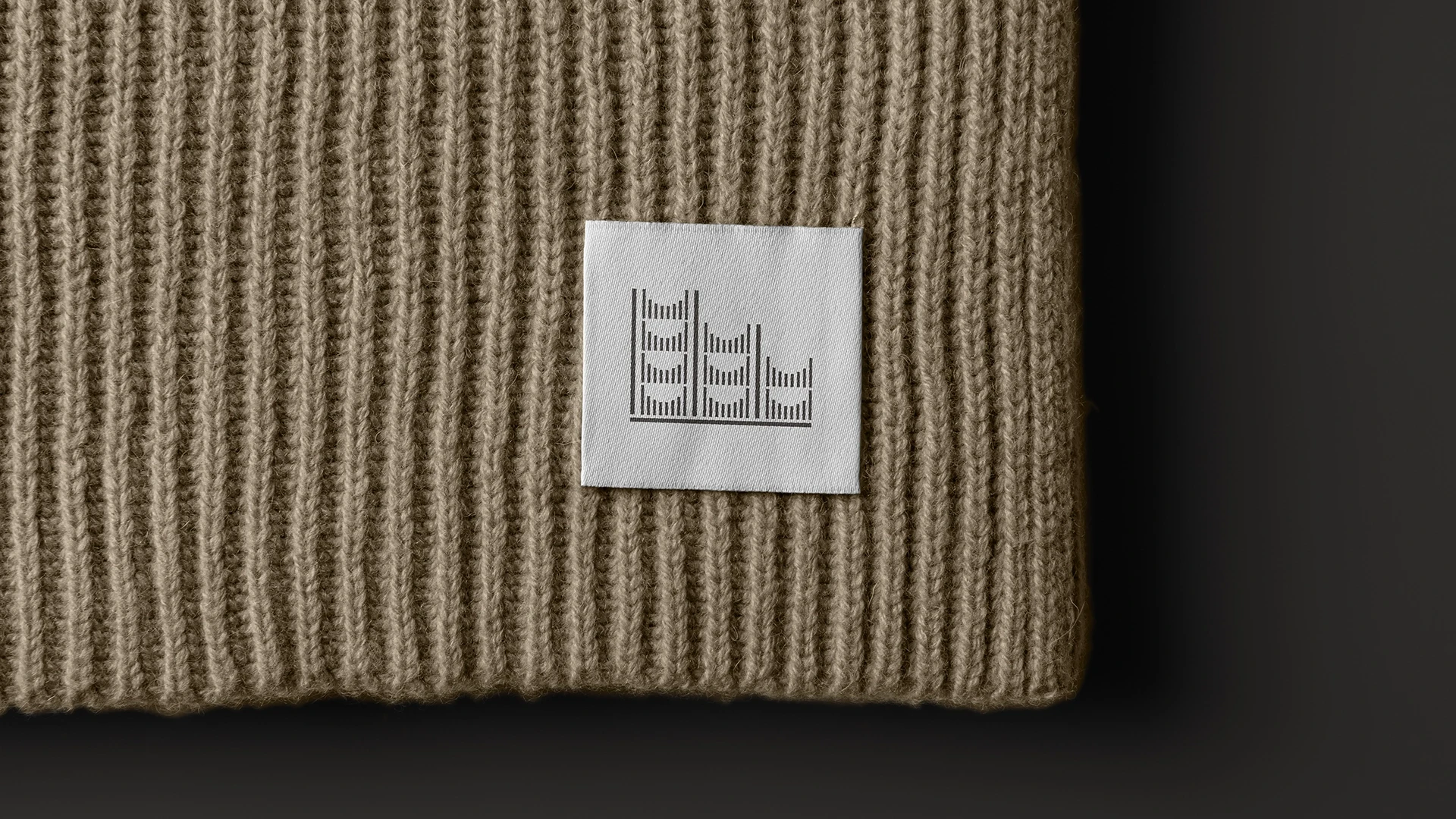
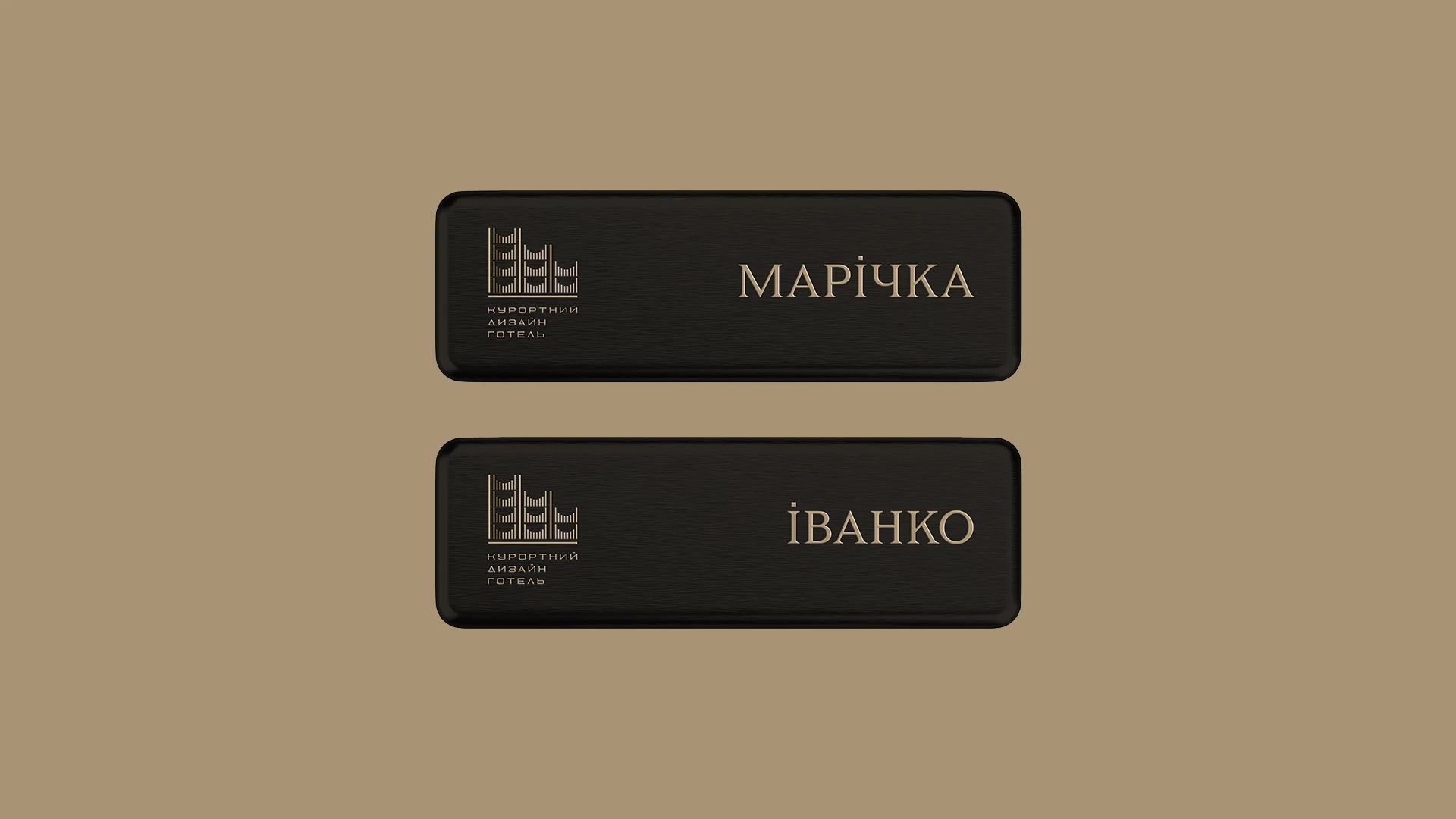
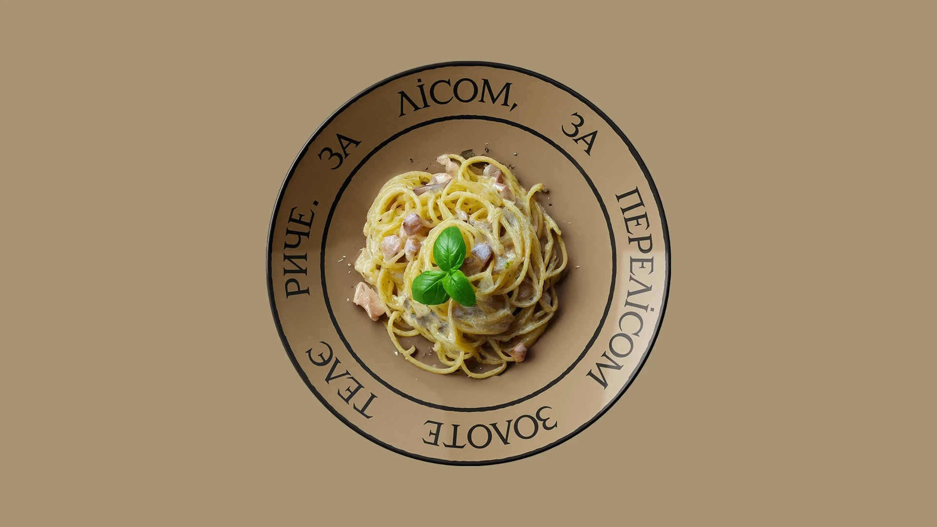
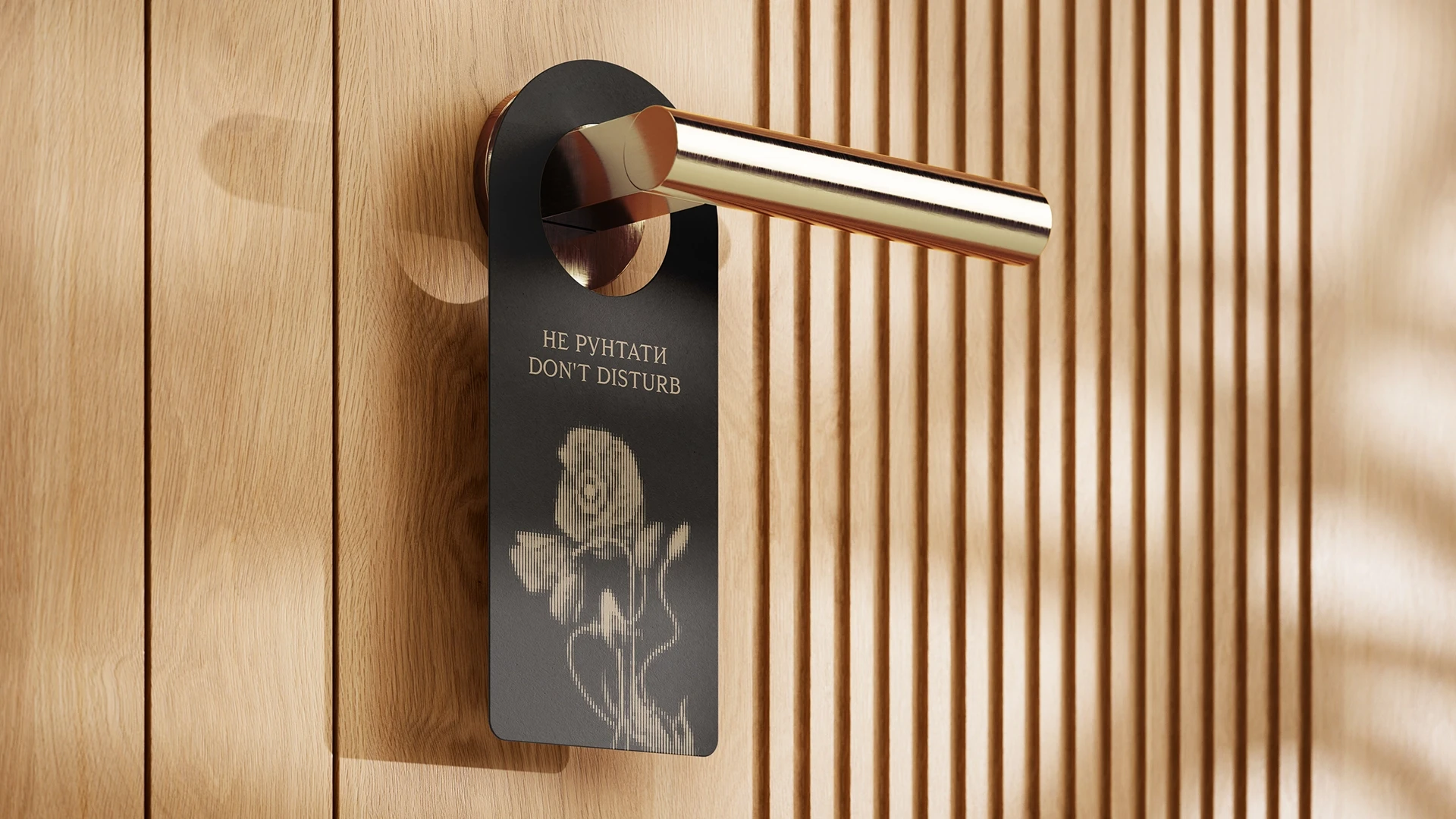
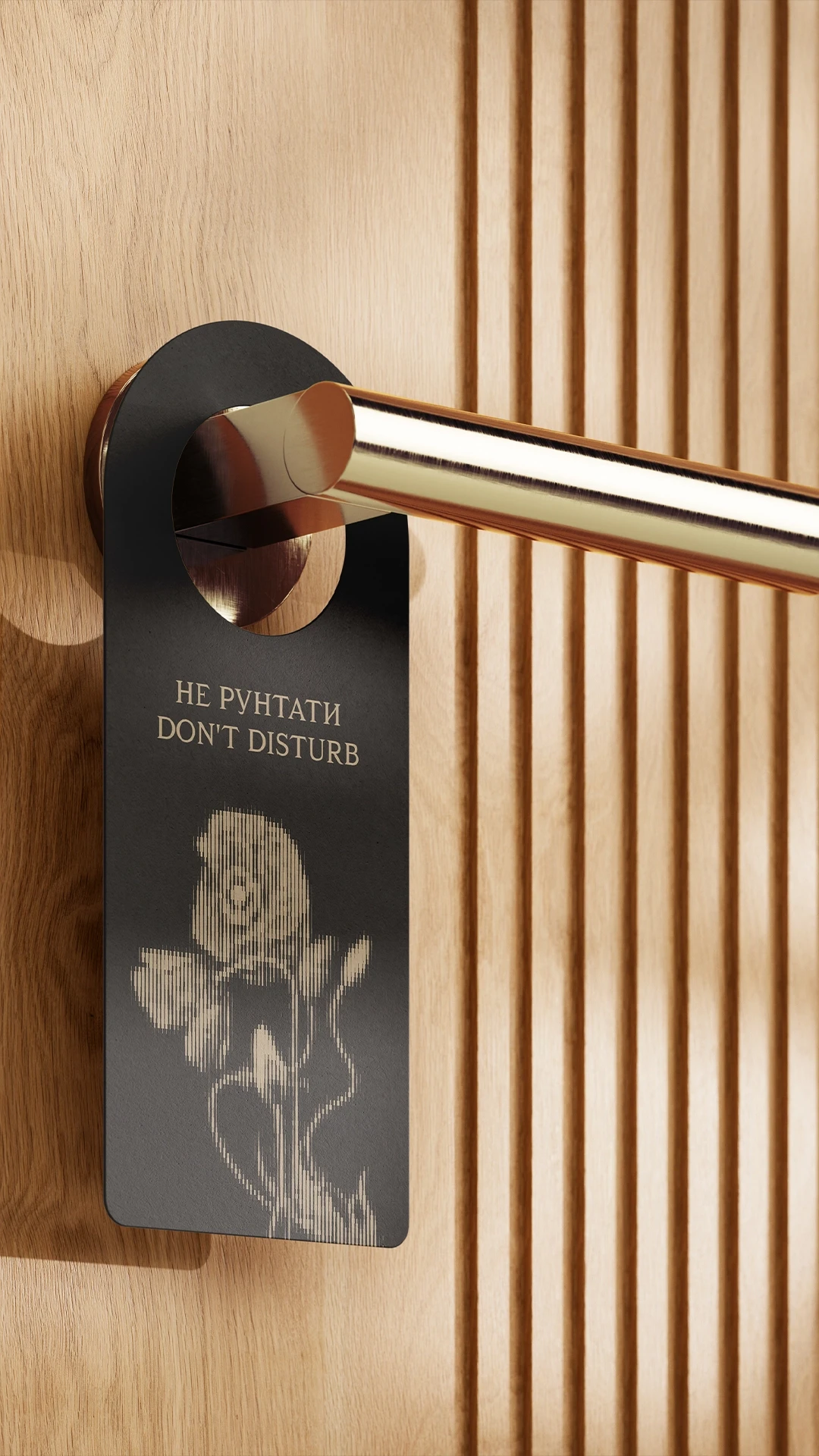
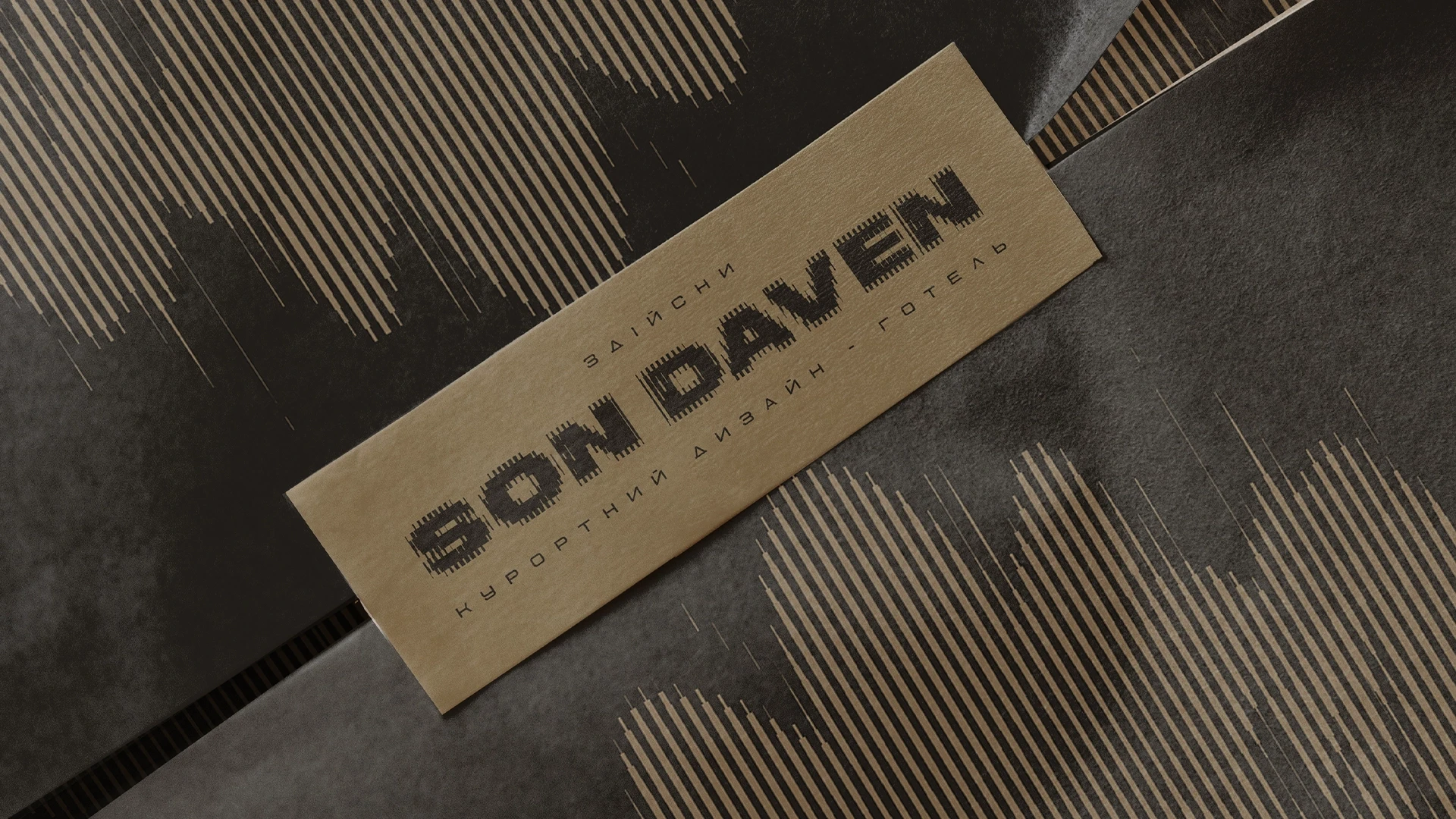
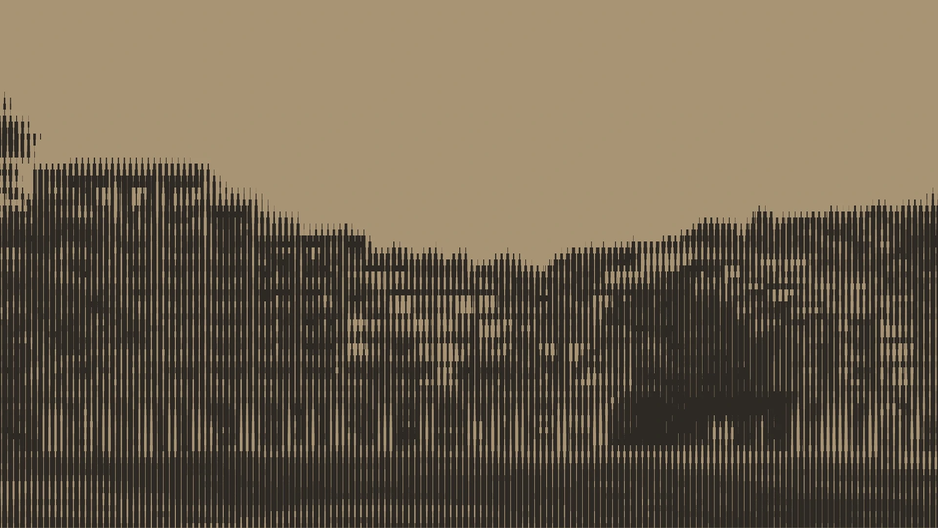
We saw that both the Hutsul ornaments, the fir trees in the valley, and the facade of the building — everything has a visual rhythm with vertical lines. By chance? Or is it fate? We don't know. But this mysterious rhythm became the basis of the identity.
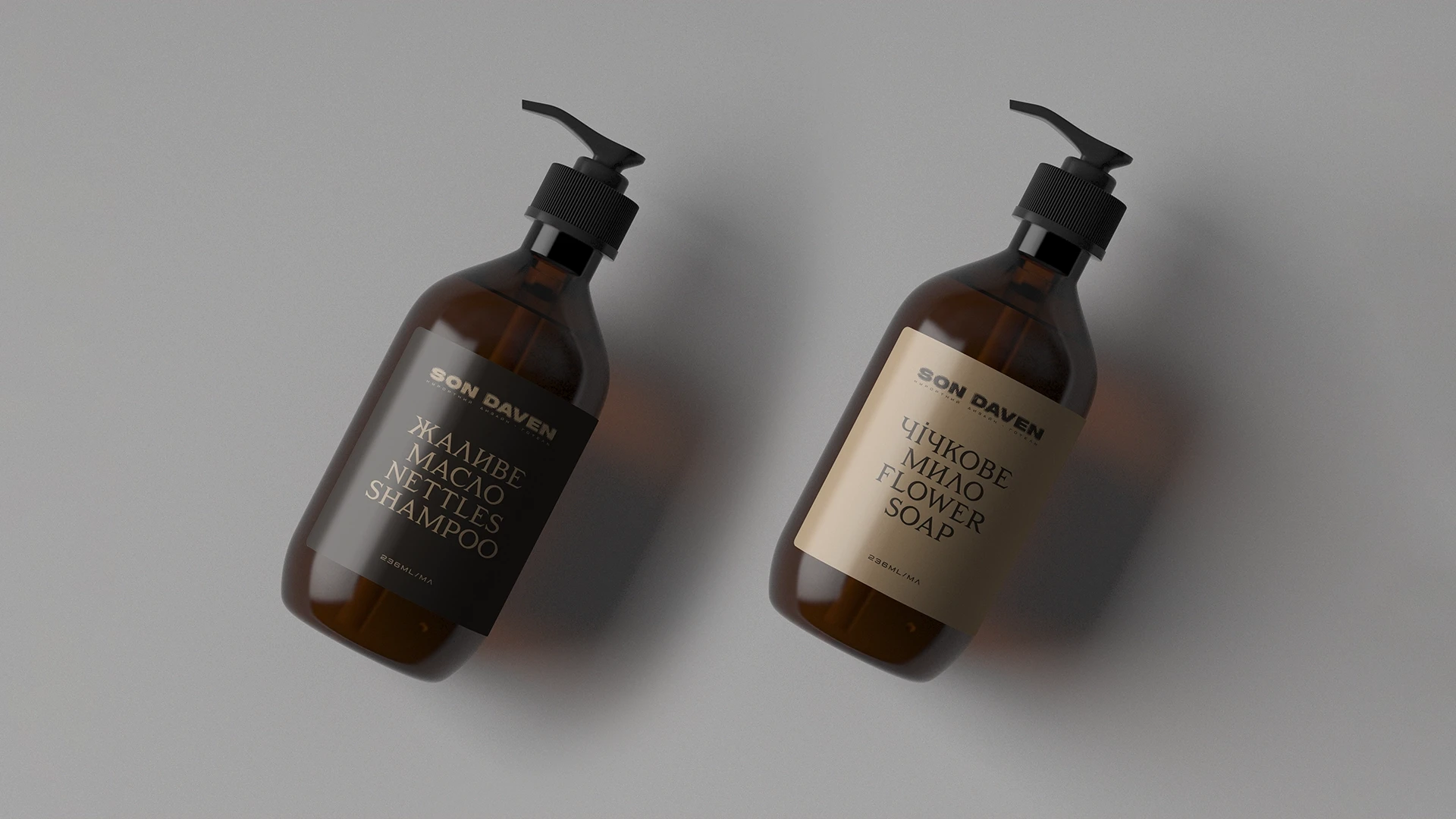
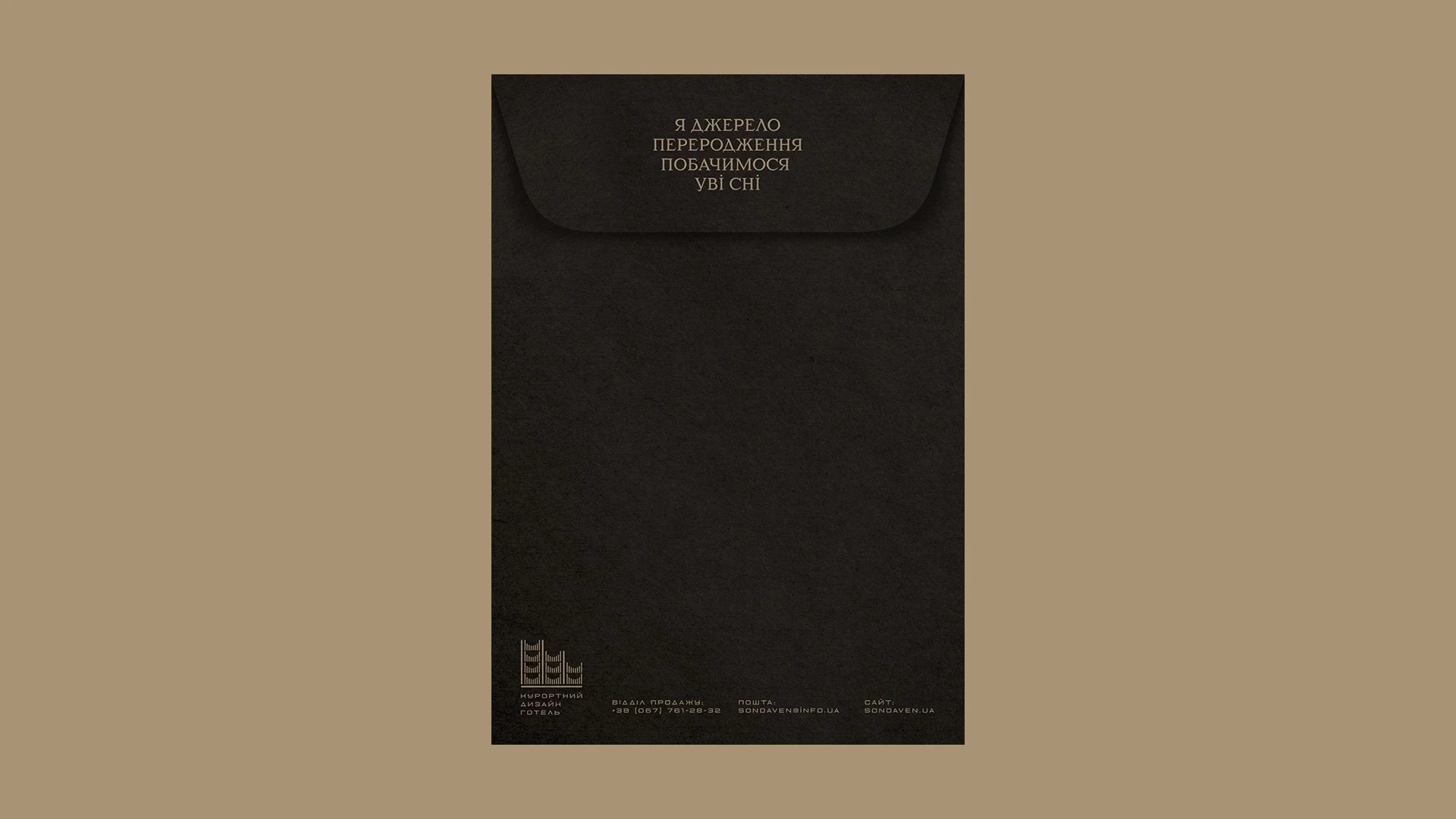
The font and color pairs convey the idea of the duality of everything connected with the hotel: day and night, dream and reality, past and future.
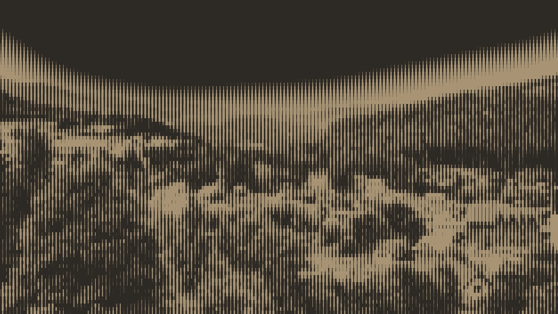
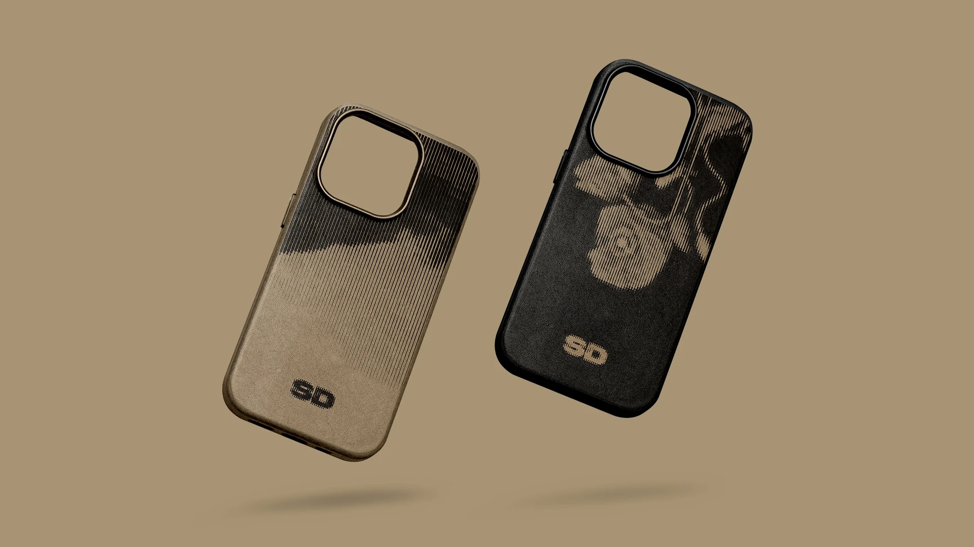
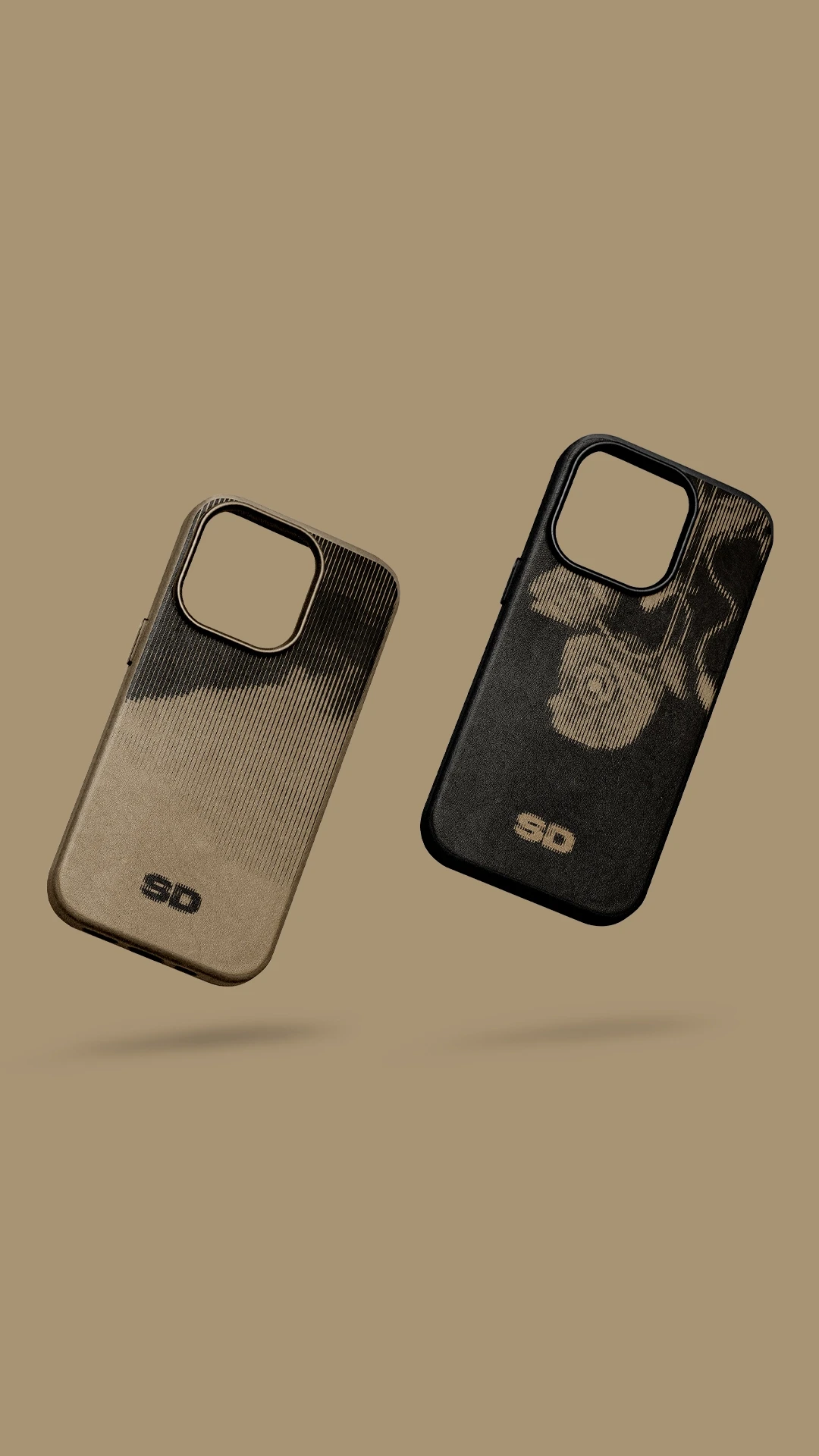
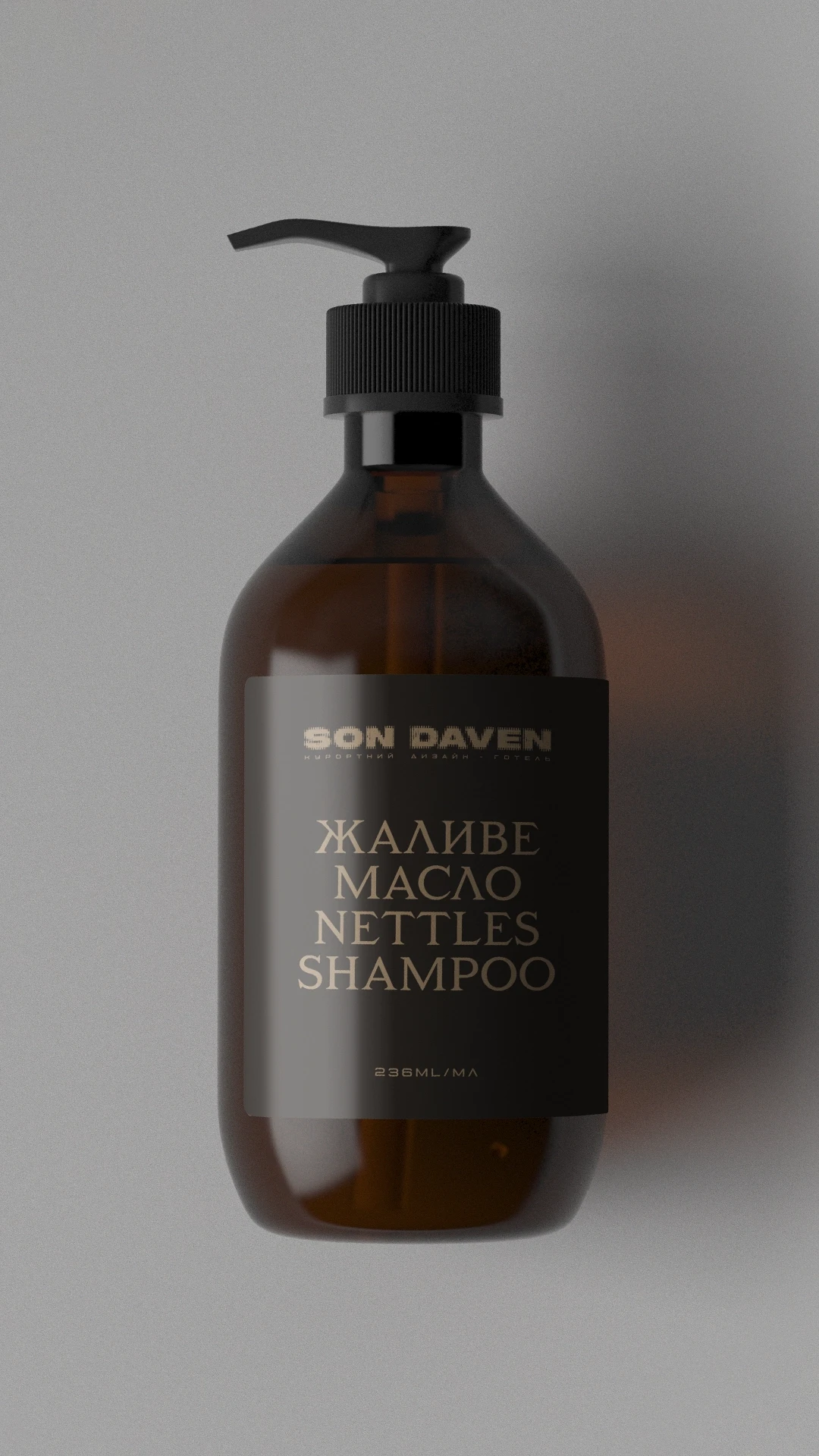
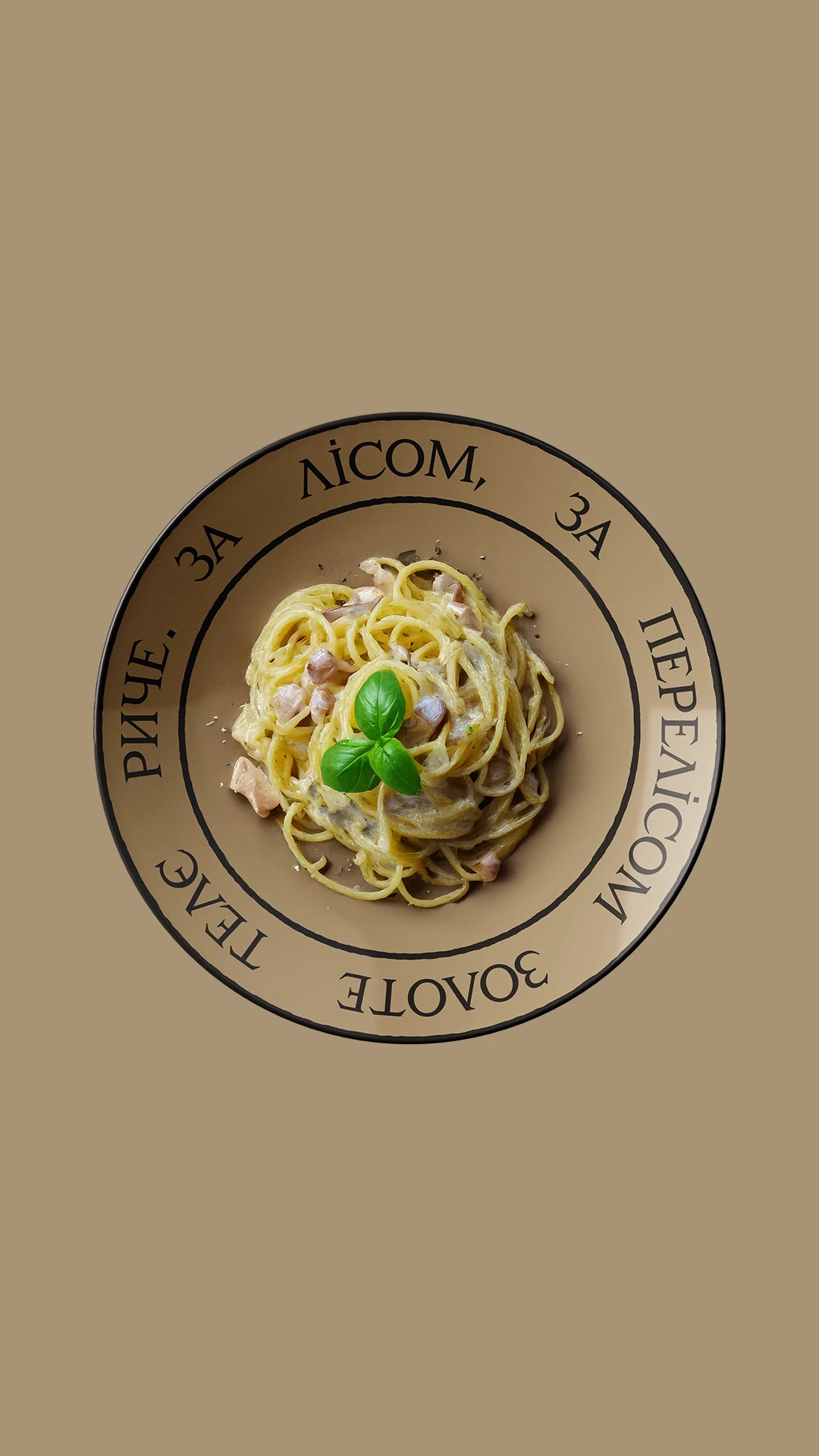
Thanks to stripes and colors, any image turns into a "dream".
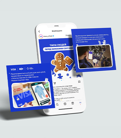
Advertising campaign to attract investors
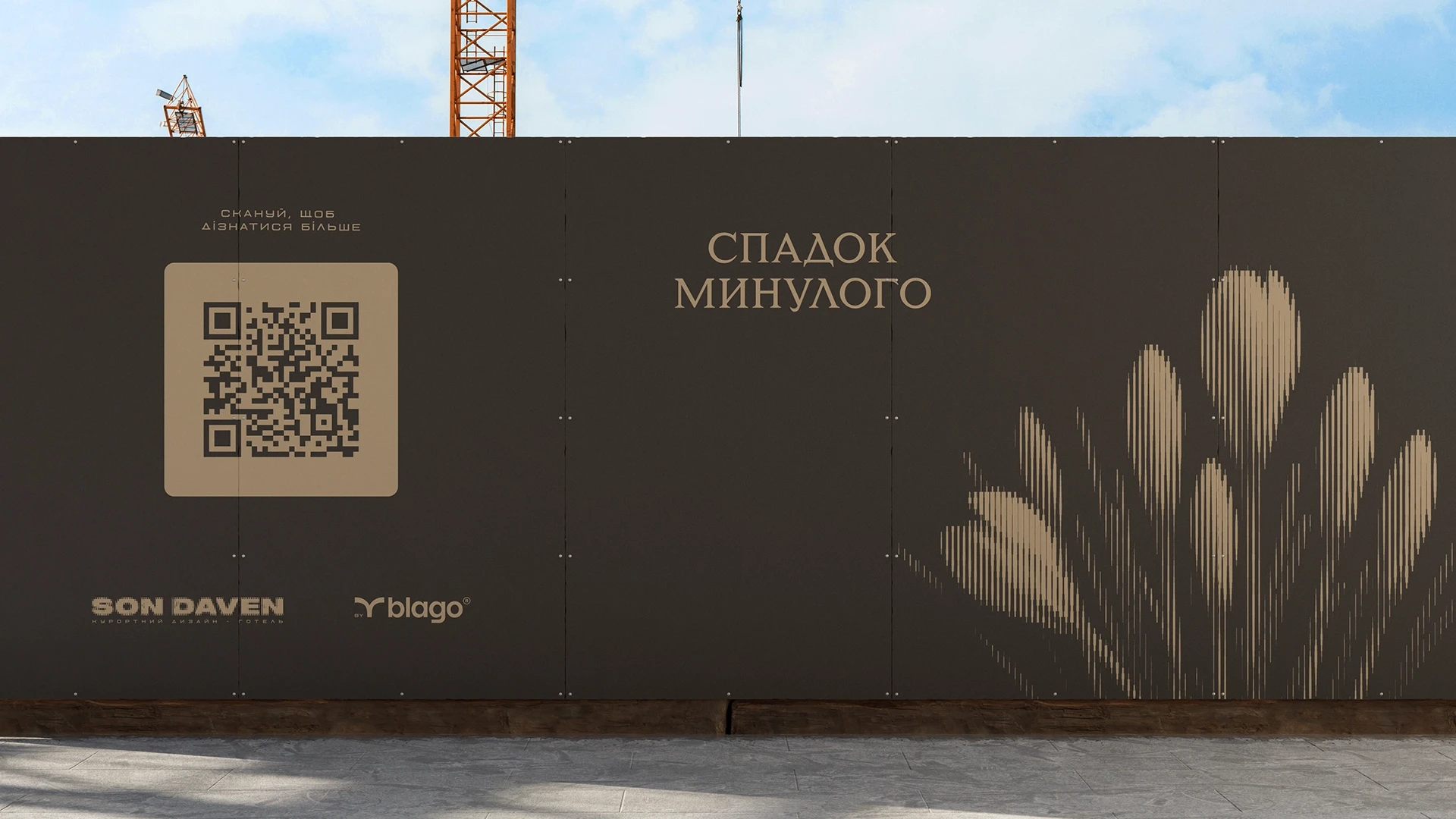
Investors want to invest in something emotional and interesting. Renderings of hotels on the slopes will no longer surprise them.
Therefore, it was strategically important in communication to convey the feeling that investors and everyone involved in Son Daven are co-authors of a true Carpathian legend. This idea is embodied in the laconic slogan — "Make it happen".
Therefore, it was strategically important in communication to convey the feeling that investors and everyone involved in Son Daven are co-authors of a true Carpathian legend. This idea is embodied in the laconic slogan — "Make it happen".
The campaign had image and product components.
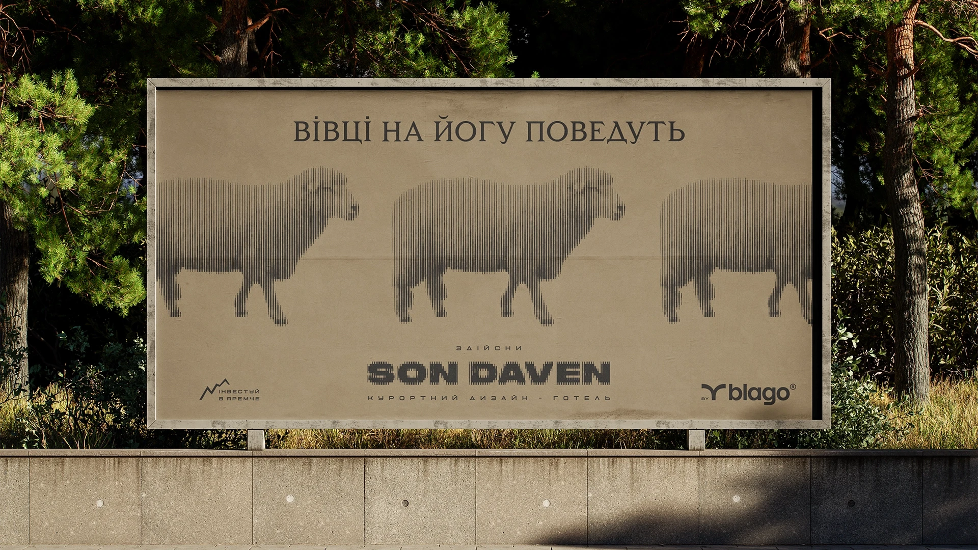
In image creatives, copywriting sounds like the prophecies of the soothsayers. So we not only told about the interesting things about the hotel, but also immediately conveyed its Hutsul atmosphere.
In the video, we showed the hotel attributes with shadows on the wall — a reference to a nightlight. It’s like listening to a legend before going to bed. The melody was taken from the folk song “Sleep Walks Around the Windows”.
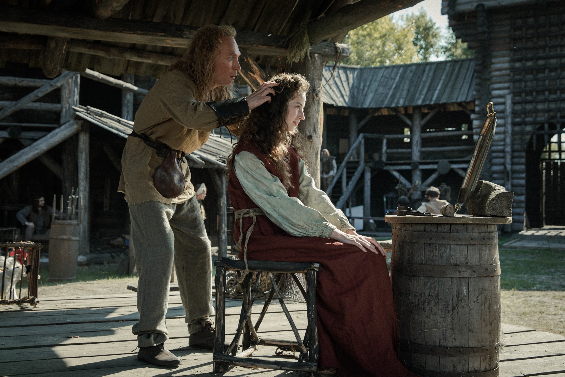
Of course, all this could have been done with AI, but Son Daven is about craftsmanship. That’s why we made real wooden stencils for shooting the shadows.
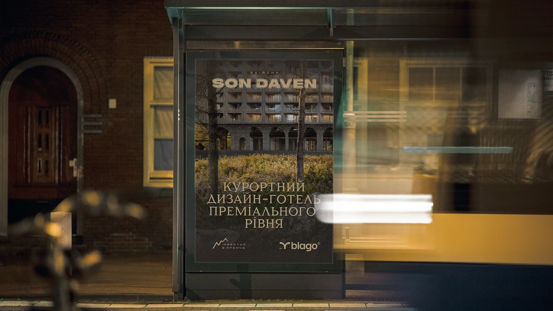
In parallel, more traditional visuals for the category were launched — with architecture and a formal tone of voice.
All of this led to the landing page, which the Grape team also worked on. The landing page turned out to be truly extraordinary. A visit to the Son Daven page is as unique an experience as a visit to the future hotel.
Immerse yourself in Son Daven.
Son Daven. Creating a brand for a premium Carpathian hotel
Was it interesting?


.webp)
.webp)